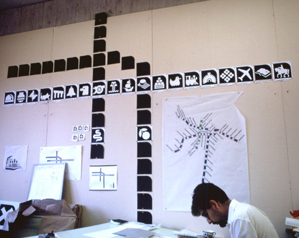
One of the best discoveries I've made on my many trips to Mexico is the Mexico City Metro System. And knowing that I love excellent graphic design, I wanted to share with you a little bit about the design of the iconic designs that guide people of all languages and nationalities throughout the giant Mexico City area. For 5 pesos (approximately 38 cents) you can take the metro to many important destinations throughout the sprawling metropolis.
Before the Metro opened in 1969, Lance Wyman, who designed the signs for the 1968 Mexico City Olympics, was asked to design subway graphics to convey how to get around and to establish the identity of the subway system.
In 1969 there were 3 lines and 48 stations. There are now over 200 stations and at least 18 lines.
The icon for the station is linked to what is happening in the vicinity of the subway stop.
And here it is in action...
The above images came from Graphic Ambient. Take a look at Lance Wyman's website (below) to see more of his memorable designs.
And below is the current Mexico City Subway System map, if you're planning to go to Mexico City!


